Casestudies
Corporate offices, London SW1
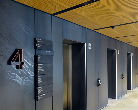
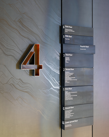
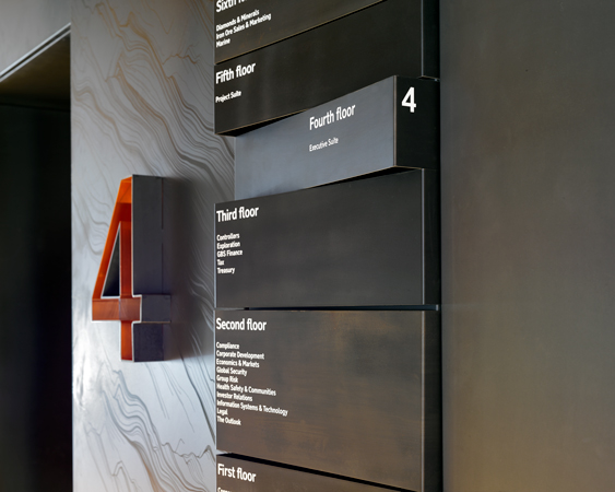
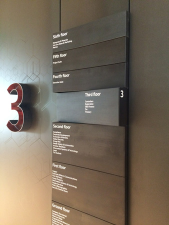
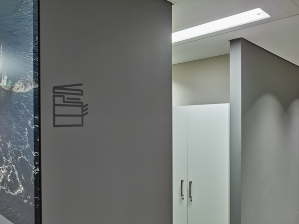
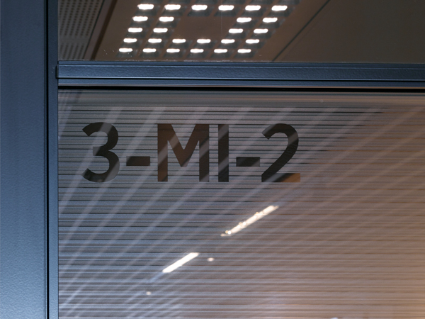
Wayfinding signage strategy and design for a luxury office development in London's West End. We took the brand guidelines of the tenant company that (as is standard) only cover print and digital and extended them to cover formal considerations of interior design in a way coherent with their existing identity but by creating a much more extensive and spatially appropriate colour, materials and textures palette. We used dark, metallic materials - hot-rolled steel lined with copper. Each floor carries its own abstract graphic pattern (related to a particular technological innovation of the host company) printed in a transparent gloss varnish. A collaboration with the London office of Australian architecture and interior design practice Hassell.
