Casestudies
Casson Mann website
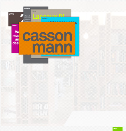
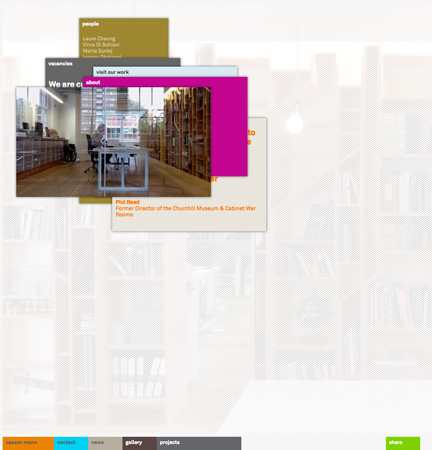
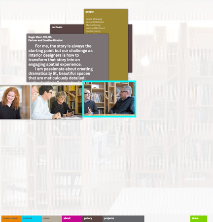
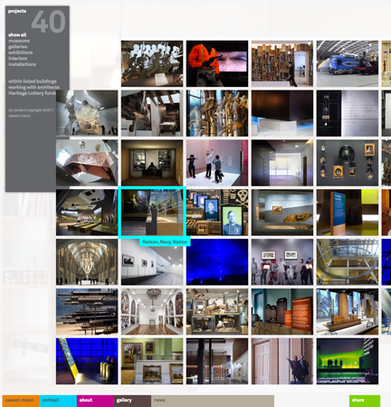
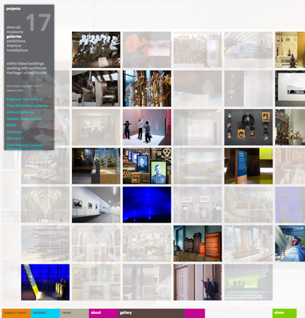
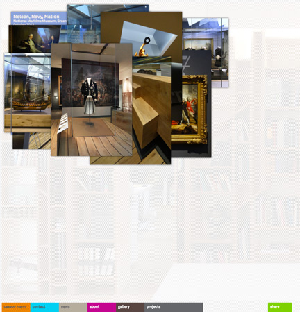
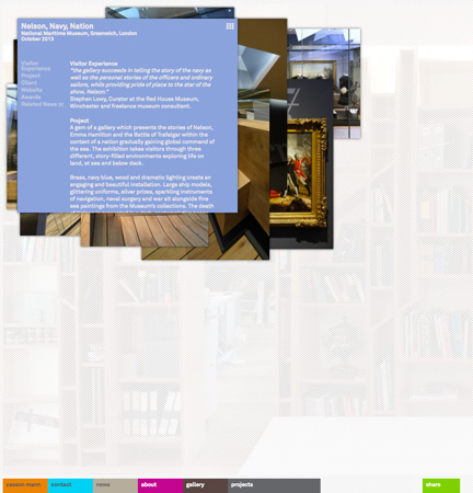
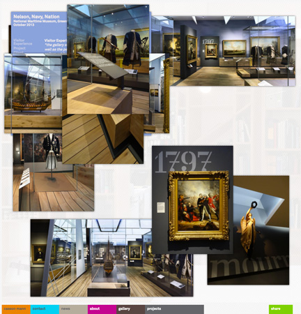
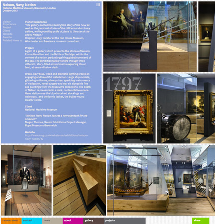
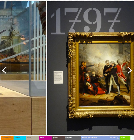
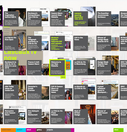
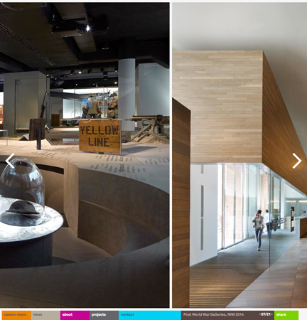
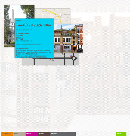
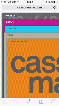
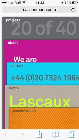
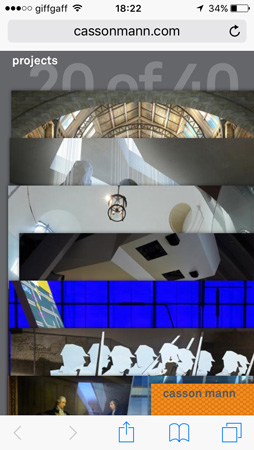
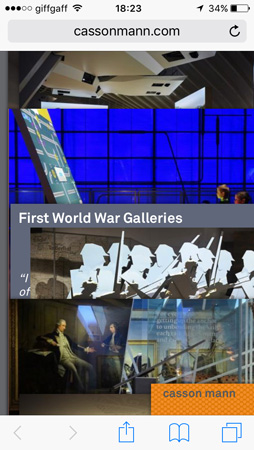
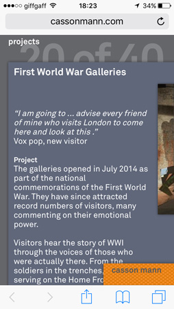
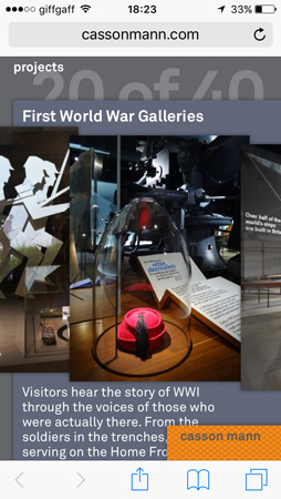
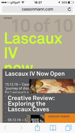
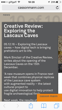
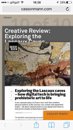
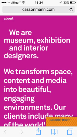
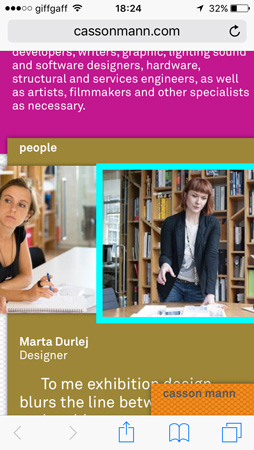
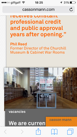
The design of a website for interior and exhibition designers Casson Mann created in close collaboration with Roger Mann and James Stone (aka mimeArtist). The interface concept was driven by the idea of information taking physical form - a way of embodying the spatial and physical expertise of our client in digital form. The result a website that eschews current conventions in digital design that have become far too constrained by the screen of the mobile phone. All information, images and text, has its carrier, a 'card', arranged in 'stacks' of cards. Stacks can be disassembled into a grid of cards, cards can be dragged around the screen and reassembled into stacks. Its an attempt to relate to the reconfiguring and transformation of cared-for-content that is at the centre of narrative production in physical space. This 'digical' (sorry!) concept was inspired by another collaboration with Casson Mann: our skeuomorphic interface design of the Churchill Lifeline in the Churchill Museum (2004). The look and feel of the website is the centre of gravity for Casson Mann's new visual identity developed under our guidance.
